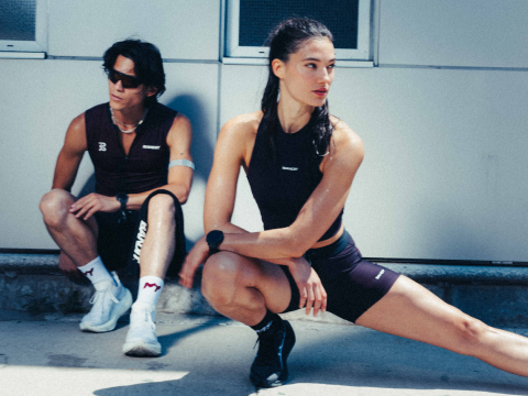
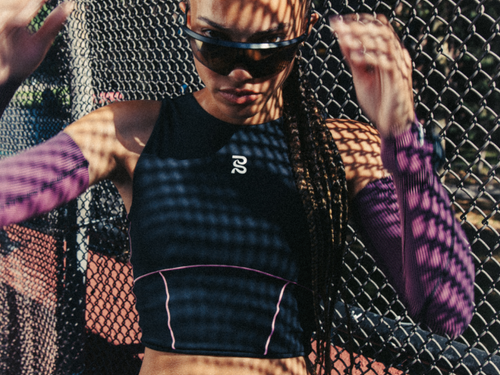
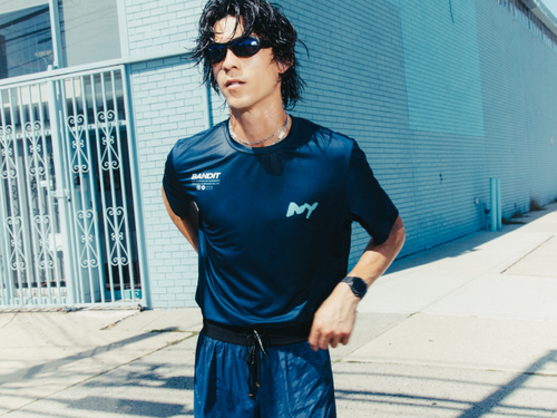
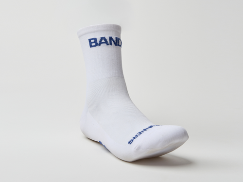
Ardith Singh, Bandit Co-Founder & Chief Design Officer, begins the creation of each new collection one full calendar year before it comes out. It all starts with a moodboard that is carefully curated and hung up on a giant board in HQ for all to see and soak in for the next 12 months. The images on the moodboard represent a variety of aspects of the collection—color tensions, fabric textures, silhouettes, graphic direction, and more.
Presenting the Summer 2024 moodboard by Ardith...
—
Finding calm in the chaos and embracing the contrast between the two. What is seen as positive and negative are both valuable, one illuminating the other.
Taking the time to be still; accepting uncertainty and temporary dissonance as you attempt unexplored adventures. Get lost in the right now.
The power of color is conveyed by the generosity of the tone; sunbaked neutrals & moonlit darks, radiant luminosity; oscillating between cool colors and warm hues.
Damp earthy greens, subtly blurred & raw contrasted against restrained brights, stopping just before something leans electric.
Grounded in ambiguous purples and magentas overloaded with pigment, dynamic color feels both elevated and unexpected


I was craving some sort of disruption for Summer. Inspired by the inevitable adversity of training in the heat of summer, not only facing rising temperatures, but competing priorities. Lazy days in the park turning into late rooftop nights, clashing with an early morning long run. Finding calm in the chaos and embracing the contrast between the two. Taking the time to be still; accepting uncertainty and temporary dissonance... a bit of summer madness.


The idea of “focus” was top of mind for me when concepting Summer 24. Images of focused light and energy were inspiring to me and a visual way to interpret that focus while being a call back to the the intense sun of the season.

I absolutely loved the way the word “present” almost looked like it was expanding-melting-liquifying. A visual representation of settling into the NOT-even if it looks a little different now than when you started. It also was a nice starting point for graphic visual direction. I love the bold, high contrast look while not being too clean/stark as well as the increasing visual weight of the font.


Connected to the ides of the “focused” light-I was inspired by the visual representation of that focus & energy shooting out from the body. Creating this otherwise even, linear visual with crazy/hypnotic/unexpected energy.


Coming off of the spring season, I wanted to explore a more disruptive unexpected colors, grounded in soft neutrals. Think damp, mossy greens, humid deep shades of purple, and brilliant rich plums. Of course black will always be a staple foundational color for us, but I was excited to dig into softer, lighter neutrals like the sandy tone of Feather grey and clean white to break up the color tension of the palette.


I loved these images because they showed summer white in a more interesting and less pristine way. Something lived in and sticky-which (visually, at least) I love.


While “water” itself was not a direct inspiration for the season. the glistening light (like reflection off of water) was something I was drawn to.


I am always inspired by photography and interesting compositions and perspectives. I find so much beauty in things that aren’t classically composed...images like this make me stop and think... pushing me to see other perspectives.

I ALWAYS have a face on my board (often thinking about a total environment: the face, the place, the space). When I saw this face-so gorgeous with the natural freckles I knew I needed her on my board!
-
The Summer Collection will be available later this May.

