Ardith Singh, Co-Founder, Chief Design Officer, and leader of Bandit's all-women design team is here with the reference imagery that kicked off the creation of our upcoming Spring Collection a year ago. Each image serves it's own purpose as a source of inspiration. Some images inspire silhouettes, others—colors, patterns, tension, blocking, and composition.
-
Movement creates the dynamic energy of the clothing we create. Inspired by the runner, we emphasize form, line & color. This gives way to a sense of simplicity in existing, ever evolving-changing-morphing. Colors with a sense of weight are punctuated with hints of bright and high contrast, blocked prints. Inspired by Minimalism as an artistic movement, we challenge the preconceived notions of what runners are (or what they should be). Exploring the true essence of the object for the art itself; allowing the connection of the fabric & the runner to expose the purity and art of running.
The big ideas and newness for the Spring Collection include fabric textures, construction innovations, and performance detailing.

Loved the black and white image of a woman, obscured by bold abstract shapes.

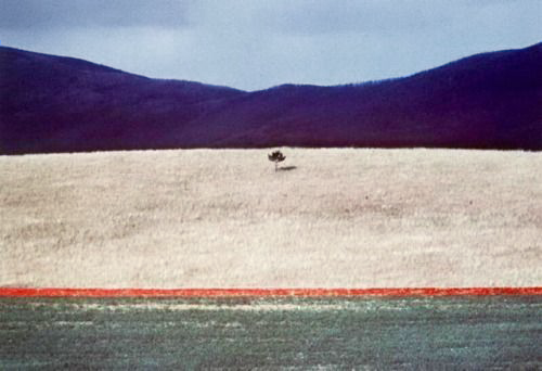
Absolutely love the pop of flame red punctuating this image of a soft neutral landscape.

Books by artists that inspire me in an environment full of textural tension, mixing natural and metallic material.


Ellsworth Kelly’s Sculpture for a Large Wall inspired both color and print for the collection.

Loved how this distorted gradient draws you in transitioning from warm to cool color.

Loved the high contrast of the static geo tile popped with the movement of the fiery red dress.


The inspiration pulled from vintage Prada (1993 to be exact) is un ending. I love the sharp, square shape juxtaposed to the curved undercuts. This influenced some of the design lines of our new race crop!

Another Ellsworth Kelly-loved the high contrast black and white piece that falls off the page, creating just as much interest in the negative space as in the foreground.


This distorted image was an early swipe that ended up coming to fruition when we shot the campaign.


Loved the higher neckline and clean finish that gives a sporty look while delicate straps lend an air of softness. Had to re-interpret this through the lens of running!


Was obsessed with this almost pixelated swipe of repeating squares (top). I was connecting it to some of Ellsworth Kelly’s works (bottom) and loving the idea that you could imagine this as both a static image that is zoomed in to create abstraction (down to the pixel level) and also be interpreted as movement and evolution as you move from one square to another.

More vintage necklines...


